Setting Up Poster Board Displays in Event Spaces
Setting Up Poster Board Displays in Event Spaces
A practical guide to choosing the right board size and designing a layout for the room that works well.
If you’ve ever been handed a floor plan and told to “figure out where the posters go,” you know the feeling. It sounds simple until you start sketching it out and realize there are a dozen things to think about at once; board sizes, aisle widths, traffic flow, where the coffee station is going to end up. This guide is meant to help you work through all of it in a logical order, so your attendees spend their time engaging with the content instead of bumping into each other and spilling their drinks.
Choosing Your Display Size
The first decision is what kind of display boards you’re working with. There are two common options for events, and each has its place depending on how many posters you need to display and how much square footage you have.
Option A
4×6 Display
Double-sided
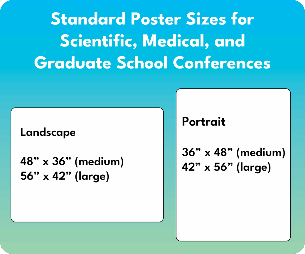
one 42” x 60” (landscape) or one 48” x 72” (landscape) per side — 2 total or
two 24” x 36” (portrait or landscape) or two 36” X 48” (portrait) posters per side — 4 total
Option B
4×8 Display
Double-sided
One 48” x 72” (landscape) or one 48” x 96” (landscape) poster — 2 total or
Two 36” x 48” (portrait or landscape) posters per side — 4 total
The 4’×6’ boards are a solid default. They take up less space than 4’×8’ and if there is only one poster per board, the 36” x 48” will have plenty of space. The 4’×8’ boards let you fit more content. These can be useful if you’re poster-heavy and space-constrained.
Plan ahead: Your poster board size should be driven by your poster size, not the other way around. Before you order anything, confirm the dimensions of the posters being submitted. A 48″ x 72″ scientific poster needs different board real estate than a 24″ x 36″ academic poster.
Sizing Up Your Space
Once you know which boards you’re using, take a good look at the room. Get the actual dimensions, not an estimate, and note where the doors, windows, columns, and fixed furniture are. These may constrain your layout more than you expect.
Then think about how many boards you need and start doing some rough math. A row of 4’ x 8’ boards can hold a lot of posters in a small linear span. This sounds great until you realize that long rows also need adequate aisle space on both sides, plus enough clearance at the ends for people to pass around and reach the next row.
Minimum Row Spacing
8 ft
Below this, aisles feel crowded even with light attendance
Comfortable Row Spacing
10–12 ft
Recommended for high attendance and to allow space for presenters and attendees
Eight feet is the floor, not a target. At eight feet between rows, two people can pass each other if they’re mindful of it, but the moment someone stops to look at a poster, the aisle starts to feel pinched. If you are displaying more than one poster per board or if the event is expecting a significant crowd, plan for 10 to 12 feet between rows wherever the layout allows.
Accessibility note: Wheelchair access requires a minimum clear width of 36” inches for a single pass and ideally 60” inches for two-way movement or turning space. Factor this into your aisle planning. If your row spacing is just 8 feet, much of that width will be consumed by people standing at the boards, so plan extra room accordingly.
Rows vs. Individual Boards
Individual boards placed separately work well for smaller events or open reception-style formats where attendees drift freely through the space. They give everything an informal, exploratory feel. The tradeoff is that you use more floor area for the same number of posters compared to a row arrangement.
Rows, boards placed end to end in a continuous line, are efficient and easy to navigate once attendees understand the layout. They also allow you to use both sides of each board, effectively doubling your capacity without adding more floor space. The main consideration with rows is ensuring they don’t become barriers that break the room in half. Rows should feel like guided pathways, not walls.
When a row reaches six or more boards, it’s worth considering a break in the middle of the row. This gap creates a cross-aisle, a pass-through point that lets attendees move between rows without having to walk all the way to the end. Without it, long rows can start to feel like a corridor, and people tend to pile up at the ends rather than distributing evenly along the length of the display. A mid-row break solves both problems at once: it improves traffic flow and gives the layout a more open, inviting feel. Even a modest gap of 3 to 4 feet is enough to signal that there’s a way through.


Entry Points and Traffic Flow
This part gets overlooked more often than it should. Where people enter the room shapes everything about how they move through it; and if they walk in and the first thing they see is the back of a row of boards, you’ve lost them before they even started.
Ideally, attendees should enter and immediately face the open ends of rows or see a clear invitation to walk into the display area. The layout should feel like it’s pulling them in, not presenting a wall. Position rows so that the ends face the entry or angle your layout so there’s a natural opening that reads as an invitation to proceed.
Similarly, think about exits. In larger rooms, a single entry/exit creates bottlenecks. Two entry points on opposite ends of the room allows traffic to circulate naturally. People can enter, work their way through, and exit at the far end without having to fight through incoming attendees.
Good practice: Leave a 4 to 6 foot perimeter lane around the outside of your entire display footprint. This gives attendees a way to navigate around the outside of the display rows.
Sharing Space: Refreshments, Seating, and Other Elements
Poster sessions and refreshments go together more often than not. The trick is placing the refreshment table where it doesn’t create a bottleneck. A coffee station right at the entrance is a recipe for a backed-up doorway. Put refreshments at the far end of the room or along a side wall, somewhere that encourages people to move through the display before they grab a cup and linger.
Seating is trickier. Chairs and small tables are great for longer events, attendees can sit with a poster presenter for a more detailed conversation, but they eat up floor space quickly. If you are including seating, cluster it at the perimeter rather than in the middle of the display area or designate a small lounge zone at one end of the room. Smaller cocktail tables are a choice that promotes a social atmosphere and take up less space. Chairs in the middle of aisles require very wide rows and are basically guaranteed obstacles.
Other elements like signage, registration tables, and AV equipment all need to be accounted for in your initial floor plan. It’s worth doing a full inventory of everything that needs to live in the room before you finalize where the boards go.

Creative Configurations Worth Considering
Not every event calls for parallel rows. If your venue is flexible and your group is creatively inclined, there are some configurations that create a more dynamic attendee experience.
One of the more memorable setups is a star or radial arrangement: boards positioned like the spokes of a wheel, with a central hub that might hold signage, a feature display, or a conversation area. Attendees naturally rotate around the outside of the star, moving from spoke to spoke. This works especially well in square or circular rooms and gives the event a real sense of energy and movement.

Another approach that works beautifully in larger venues is a hybrid layout: single-sided boards placed flat against the perimeter walls, with double-sided boards arranged in rows in the interior of the room. This maximizes your total poster count while giving the room a sense of depth and inviting attendees to explore both the edges and the center.
One layout that works particularly well when you want to preserve a large open gathering area is to place single boards perpendicular outward from the side walls of the room. Rather than placing boards in rows that divide the space, boards are positioned perpendicular or at an angle, fanned out from the walls like outstretched arms, leaving the center of the room completely open. This open center becomes a natural space for mingling, seating, a refreshment station, or simply breathing room in a busy event. Because each board is a single unit rather than part of a continuous row, attendees can approach from multiple directions and the whole setup feels more relaxed and social. It’s a great option when the event has a reception or networking component alongside the poster viewing.

A Few Things That Often Get Forgotten
Even well-planned layouts can run into avoidable problems. Here are a few things worth double-checking before setup day:
Numbering and wayfinding: In any event with more than a handful of boards, a numbering system saves a lot of confusion. A simple floor plan map at the entry point, even a printed one on a table, helps attendees plan where they want to go rather than wandering randomly.
Space for presenters: If your poster session includes presenters standing at their boards, account for the extra space they’ll occupy. A presenter standing in front of a board can effectively reduce the usable aisle width by 18 to 24 inches. This is a meaningful chunk of your 8-foot minimum.
The bottom line: Good poster display layout is about creating an environment that makes people want to linger and explore. When aisles are generous, traffic flows naturally, and everything from the refreshments to the seating is placed thoughtfully, attendees focus on the content, which is the whole point.
Layout planning is genuinely one of those tasks that rewards taking an extra hour to think it through before anything gets moved into place. A few diagrams sketched on paper or a quick digital floor plan will save you from an expensive rearrangement on the day of the event. This is where Bay View Exhibits really shines. We understand that event planners have a lot on their plate, and figuring out the best configuration for poster display boards is just one piece of a much larger puzzle. Our experience means we’ve seen what works (and what doesn’t) across a wide range of venues, room shapes, and event formats. As you’re working through the details and finding your way to a solution, we’re here to help. Bay View Exhibits is the partner you can count on to make it all come together.
Get Your Free Quote Today!
Fill our our contact form or click the button to fill out the full proposal request.